/ Logo design
/ 2025
Beds Squash & Racketball
BSR is an online resource for Bedfordshire, dedicated to providing squash and racketball players with up-to-date information and news about what's happening in the county. With a website redesign in the works, the guys at BSR approached me to breathe life into their existing logo.
/ Logo design
/ 2025

Refresh or redesign?
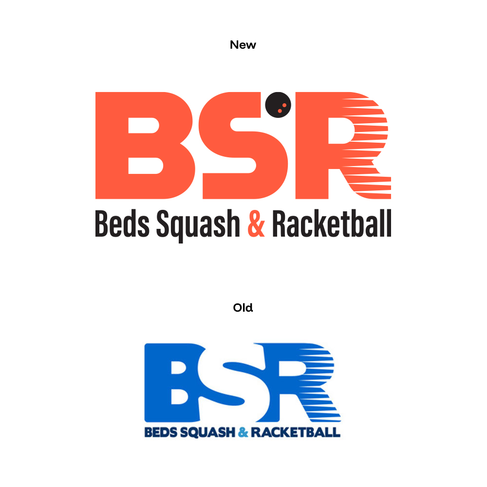
With highly condensed letters, and without a nod to squash or racketball, their logo was hard to read on certain backgrounds, further compounded by not having a reverse white option for dark backgrounds. Crucially, they didn't have a vector version of the logo either, meaning printing the logo or scaling it up would produce a pixellated mess - not ideal! The goal was to simplify the design, utilise a colour palette that tied it closer to England Squash, and include an immediately recognisable visual squash/racketball element.



Playing ball
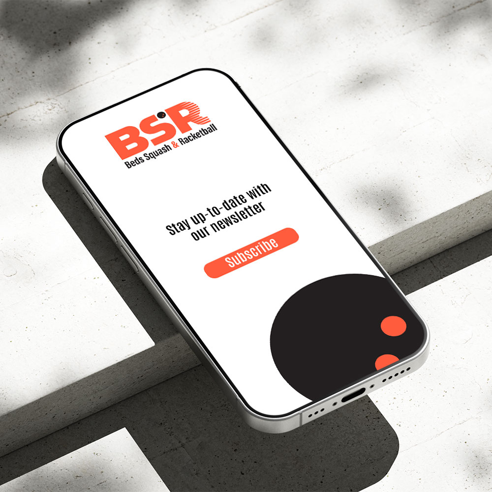
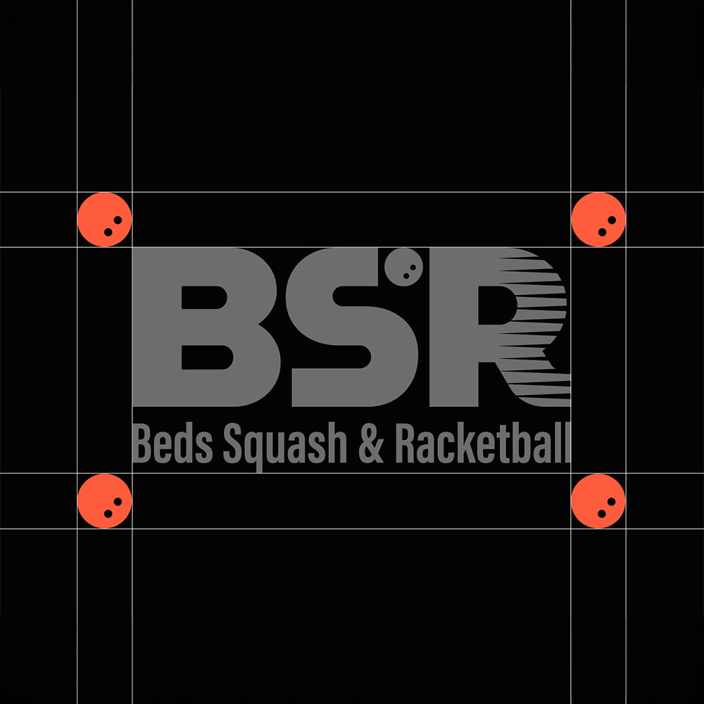
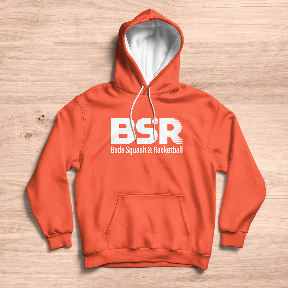
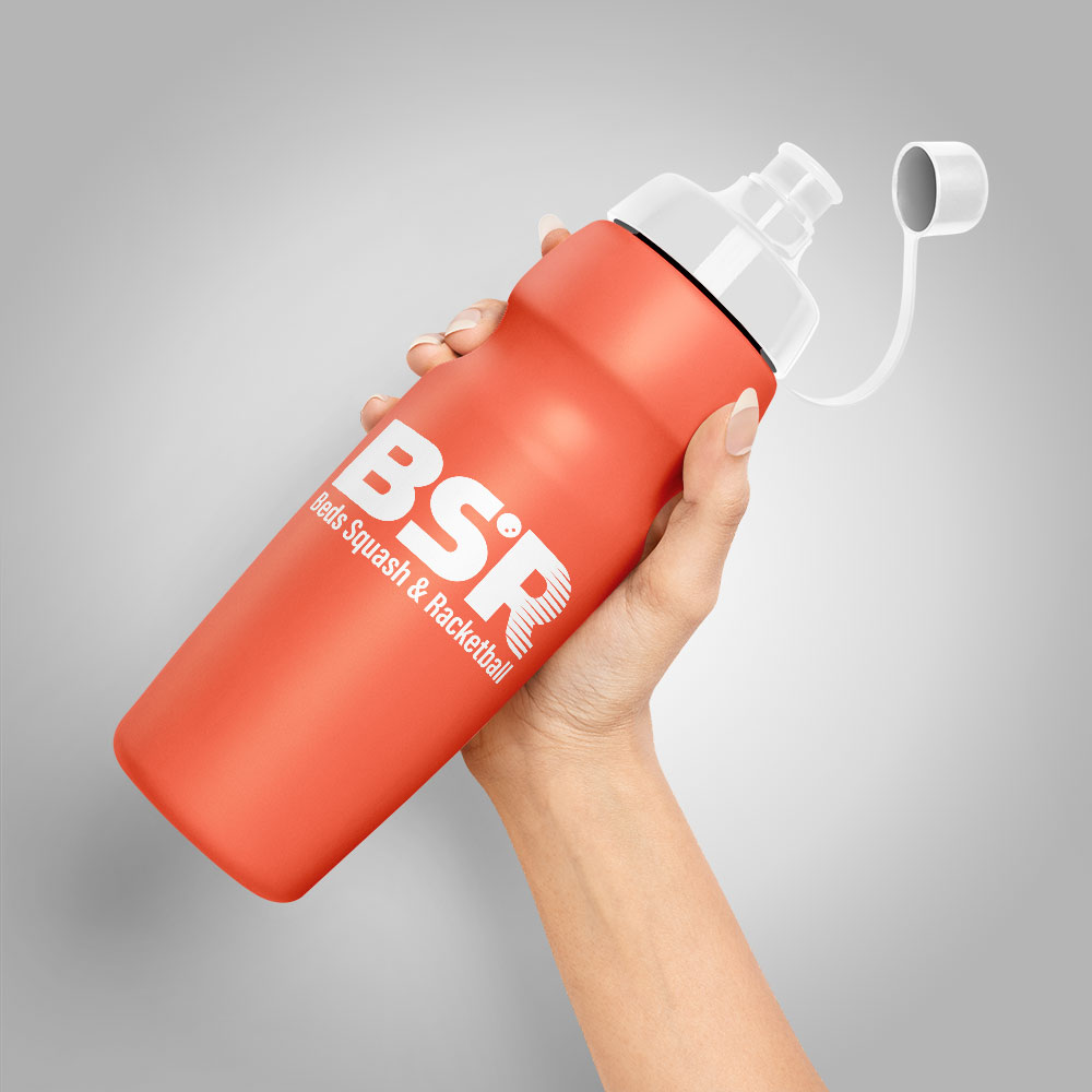
Creating a customised version of the MuseoModerno font, I used it's flowing form to craft a modern, minimalist logo that evokes the dynamism and speed of squash and racketball. The placement of the ball between the 'S' and 'R' adds a dash of playfulness, while also achieving the goal of instant recognition of squash and racketball. Pairing the logo with a condensed font for the tagline allowed the tagline to be larger, while still giving it plenty of breathing room.
Final thoughts
Choosing between a refresh and a redesign comes down to several things: Is your current logo starting to look a bit dated? Does it scale down poorly in small areas, such as, social media profiles and mobile websites? Has your brand evolved into new markets and audiences? Refreshing it with minor tweaks and simplification, while introducing a brandmark, all help your brand to navigate the modern world where your logo can appear across a multitude of devices and screens.
Has your brand's direction completely changed? Does it have a new vision, a new mission? Does your logo no longer stand out from the competition? A redesign gives you the chance to make a statement and usher in a bold new chapter.